REVA Electric
2017-2019
Join the Reva-lution.
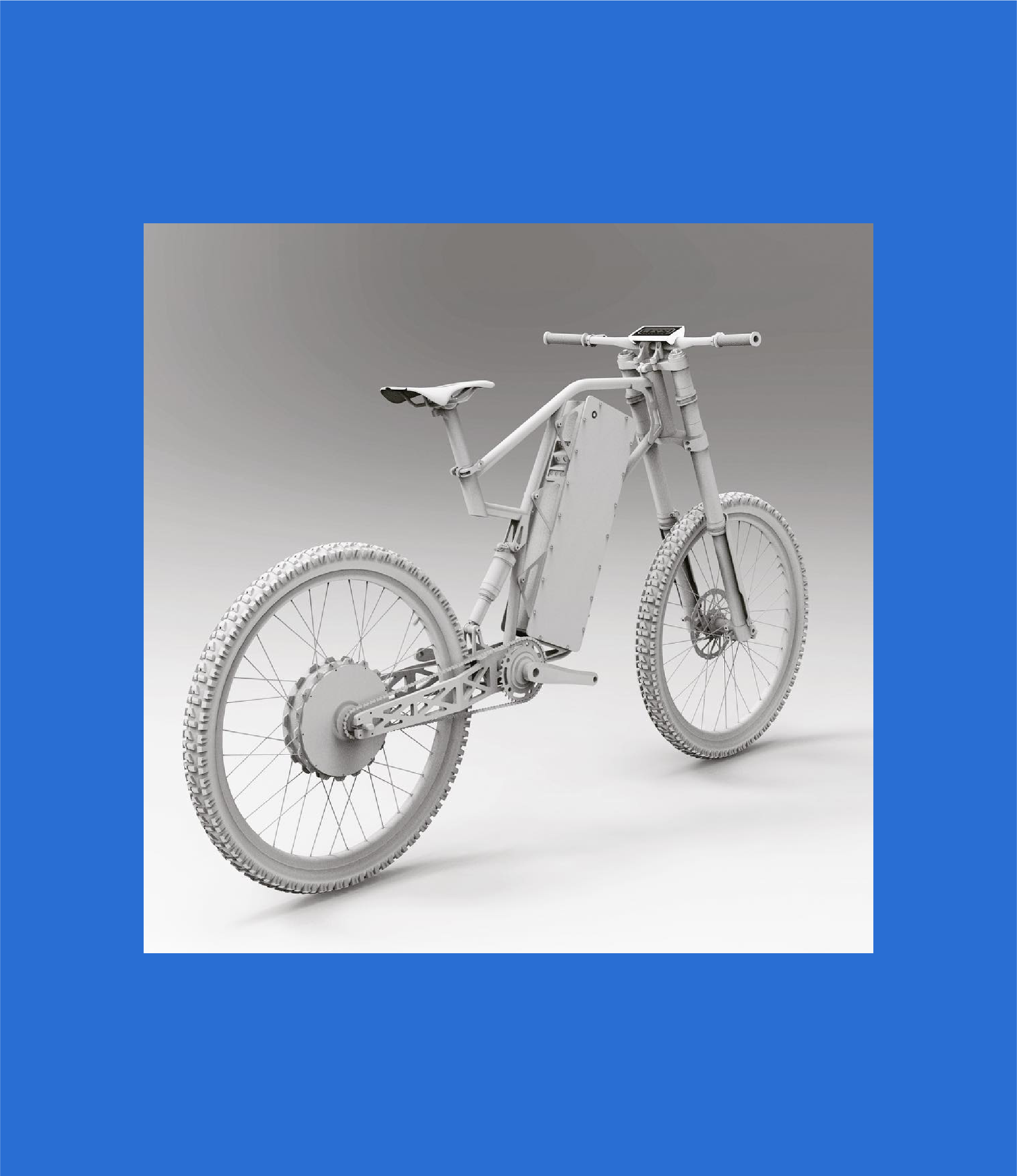
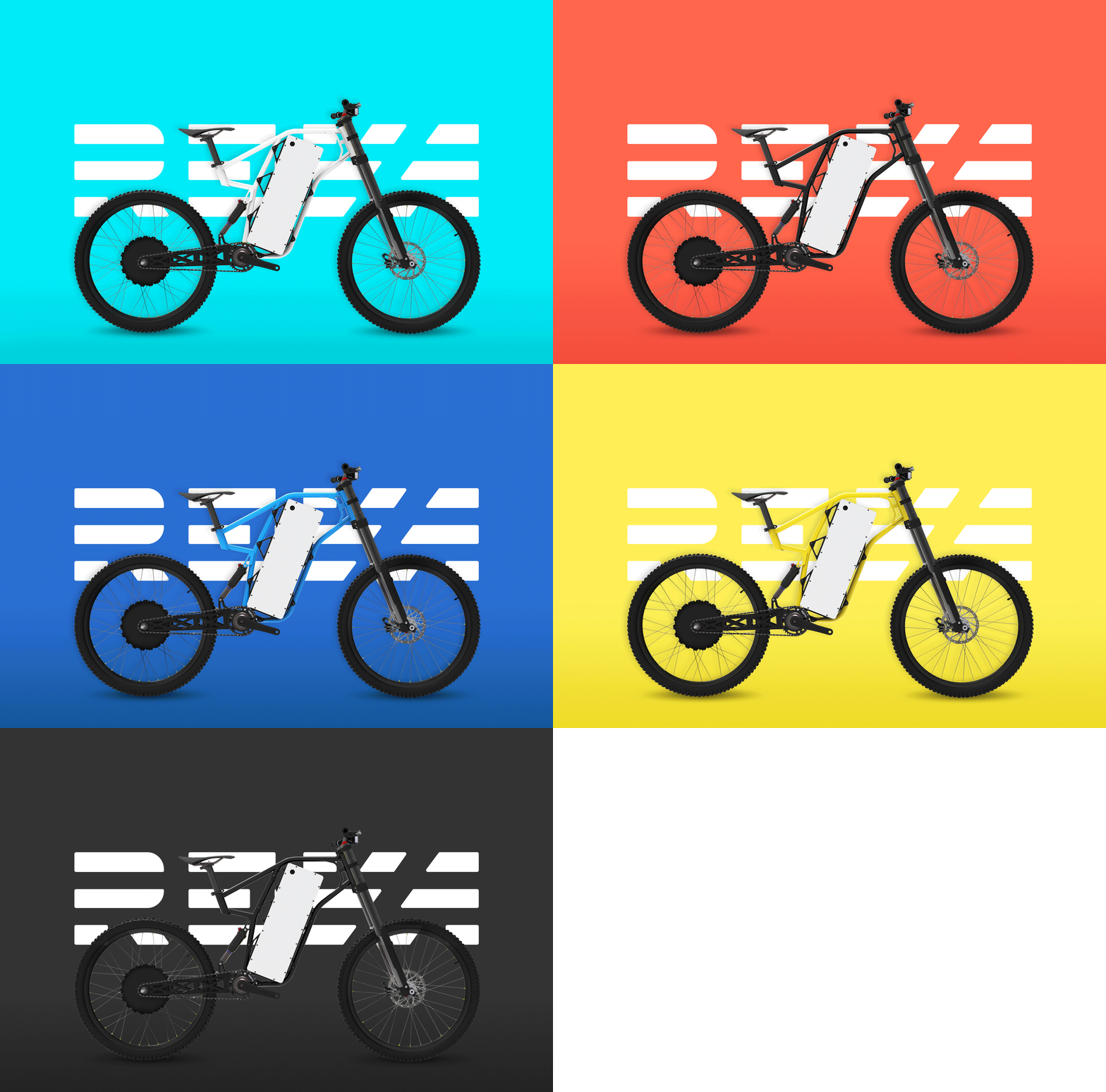
REVA Electric is a start-up e-bike company with the mission to make the best damn bike on the market. I was brought on as Chief Design Officer as they were (literally) creating their first prototype and gearing up for the eventual crowdfunding campaign.
Tasked with building the brand from the ground up, I created a bold and extensive brand system to support the launch of the brand on social media and throughout it’s Indiegogo campaign.
Services →
Brand Identity
Bike Design
Merchandise
Signage
Collateral
Brand Identity
Bike Design
Merchandise
Signage
Collateral
Credits →
Photography REVA Electric
Typeface Titling Gothic
Photography REVA Electric
Typeface Titling Gothic
Brand Identity System
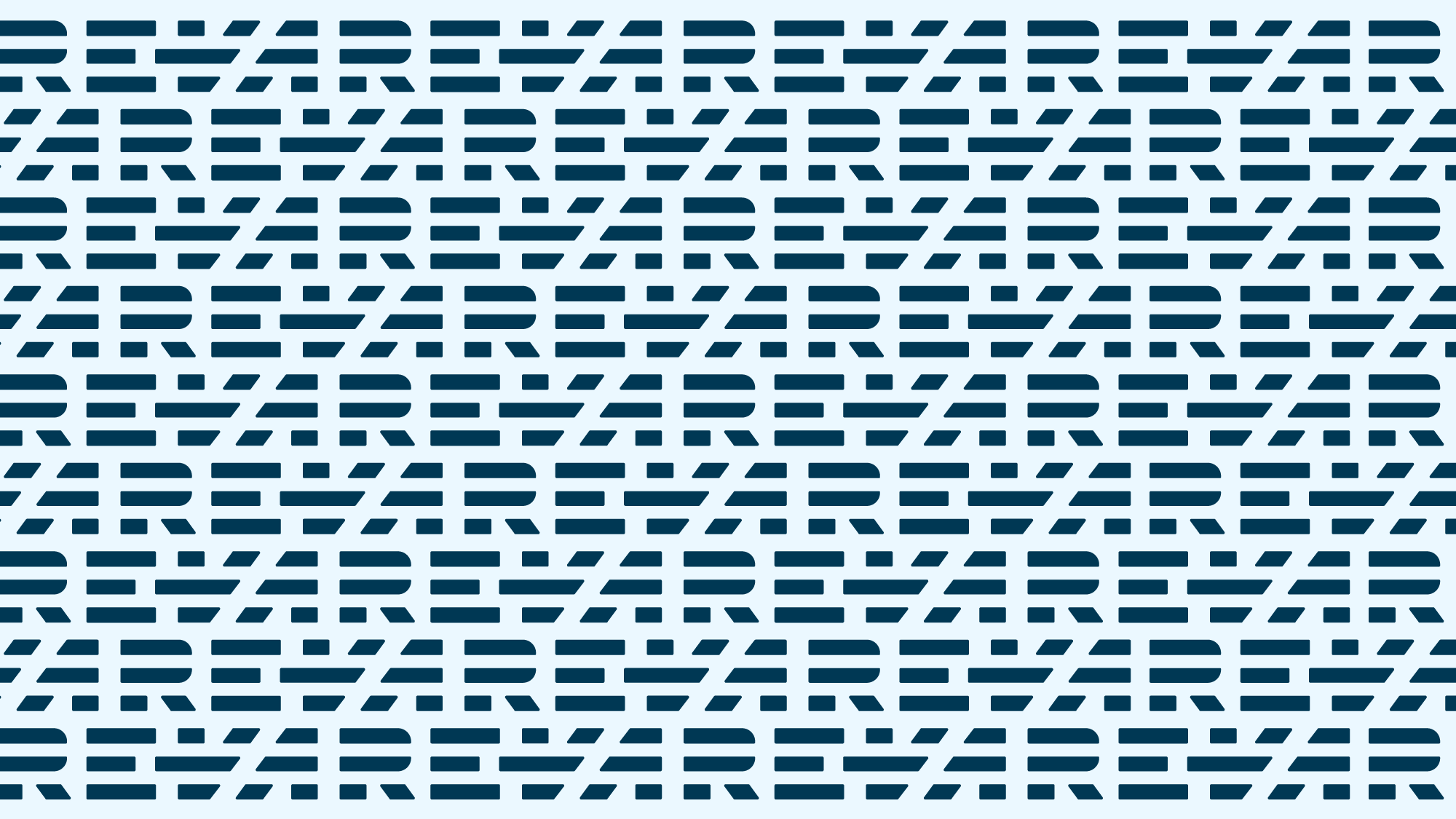
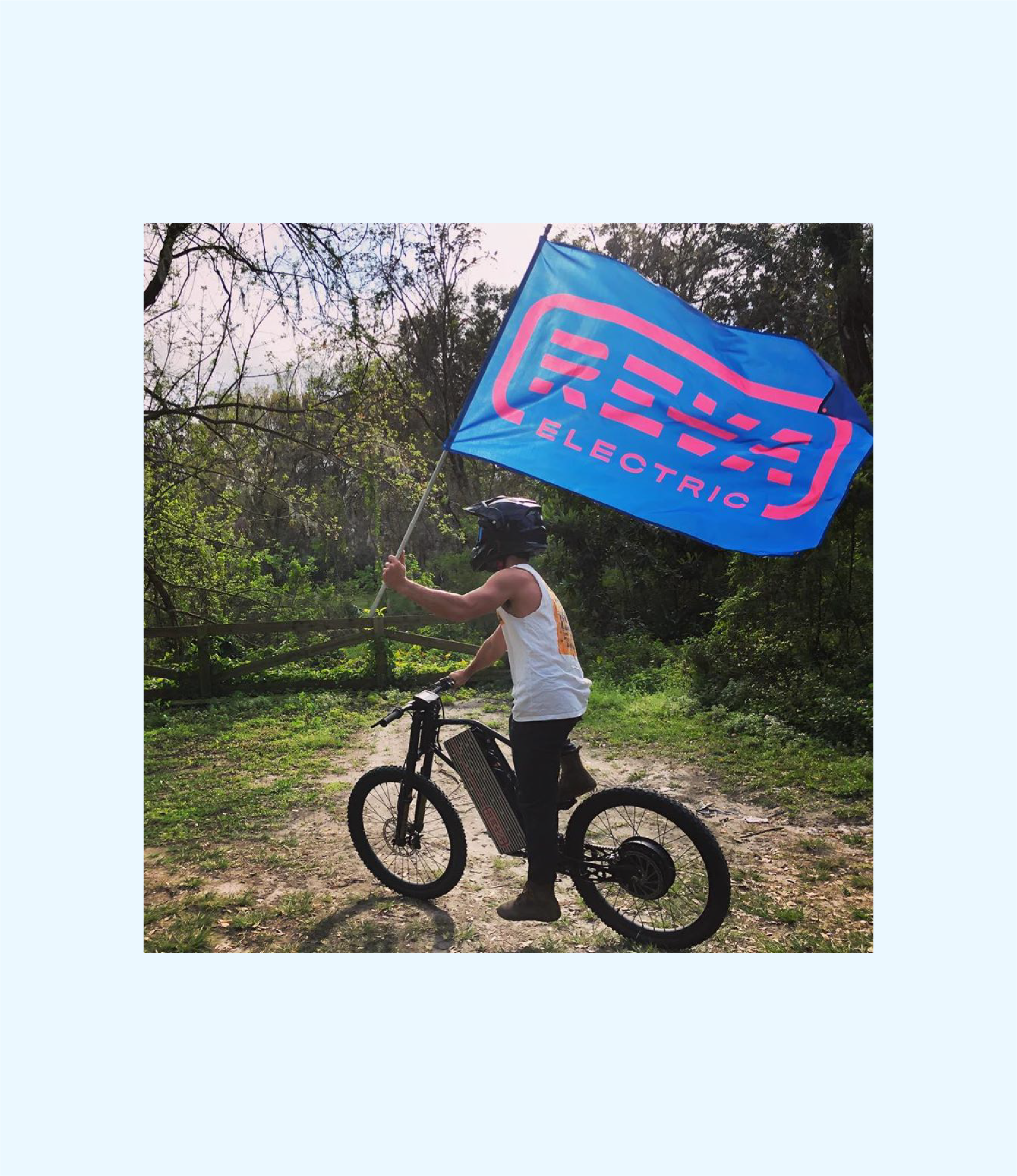
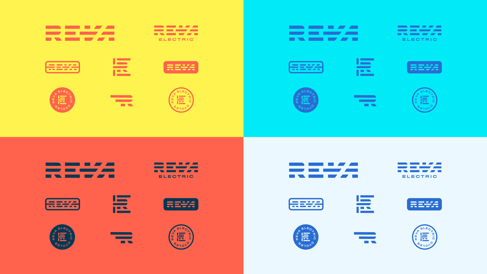
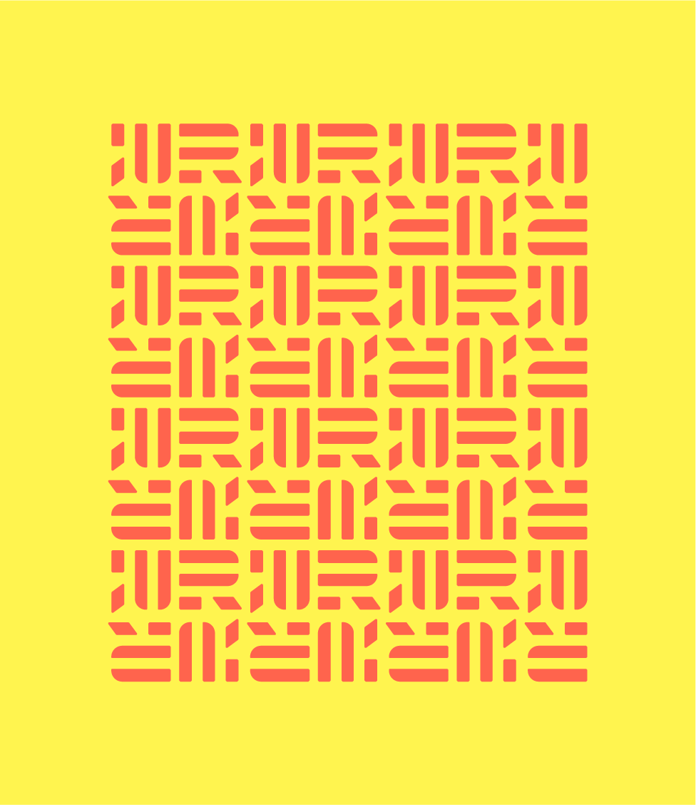
For REVA, a brand is not just a singular logo but a family of marks and badges that share the same foundation and visual language.
The central graphic thread is the linear, reductive construction of the icons and wordmarks, which feel more like they were assembled than drawn.
The central graphic thread is the linear, reductive construction of the icons and wordmarks, which feel more like they were assembled than drawn.


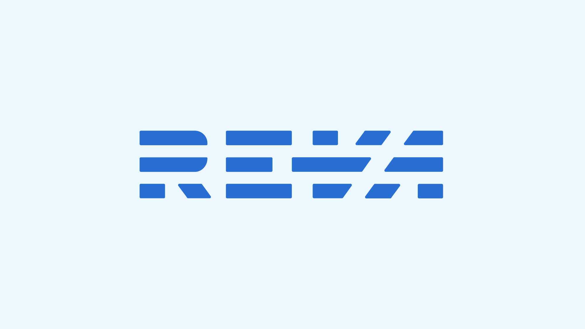
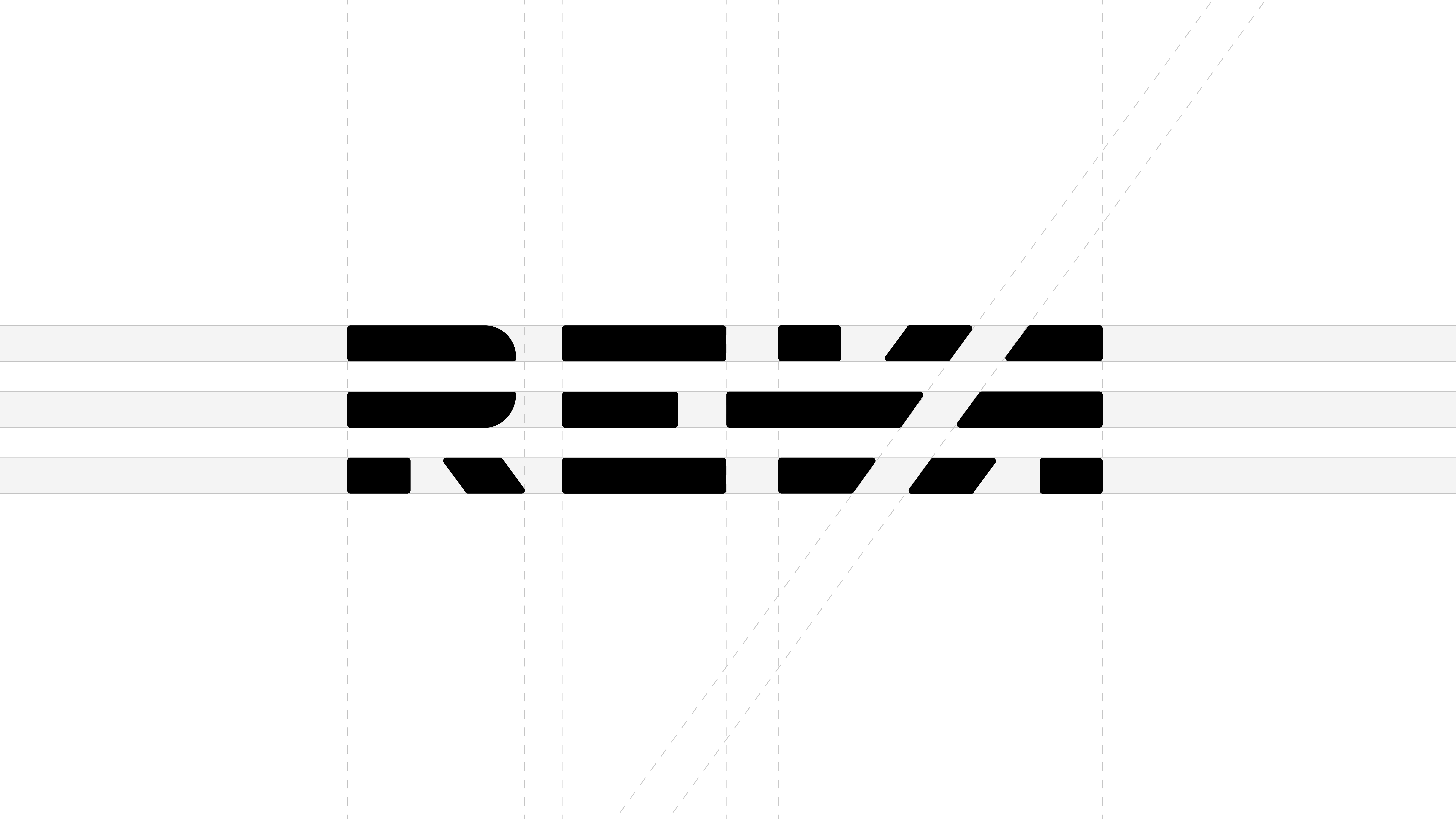
Custom Wordmark Construction
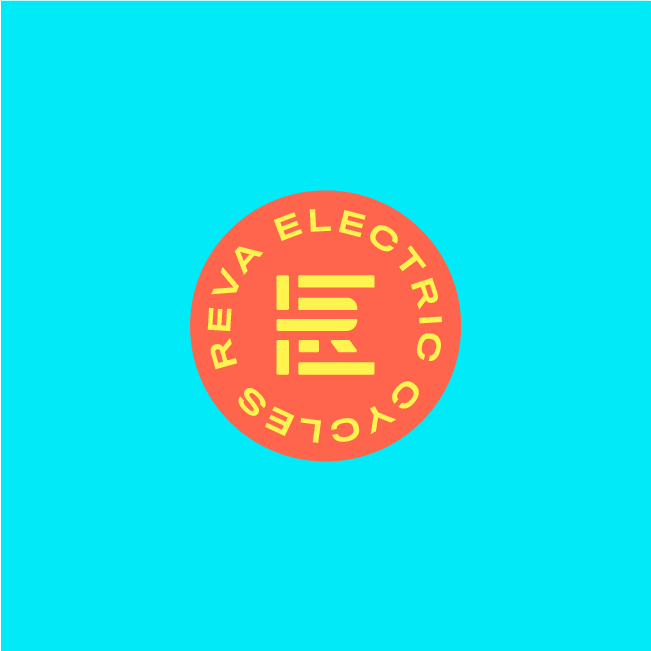
The three lines represent the tenets of REVA: Performance, Engineering, and Technology. It also helps the logo be readable and reproducable at any size, scale, or method of application (be it print / laser engraving / machined / etc.)
Fun fact:
It was originally intended for the REVA wordmark to be laser engraved on the battery box shell and backlit by an LED. Thus, it needed not to contain any closed shapes, like the open spaces typically found in an “R” and “A”. Though this didn’t make it into the final bike design, the logo stuck. The slight rounded corners tone down the aggressive angles and hard lines.
It was originally intended for the REVA wordmark to be laser engraved on the battery box shell and backlit by an LED. Thus, it needed not to contain any closed shapes, like the open spaces typically found in an “R” and “A”. Though this didn’t make it into the final bike design, the logo stuck. The slight rounded corners tone down the aggressive angles and hard lines.
 REVA 2.0
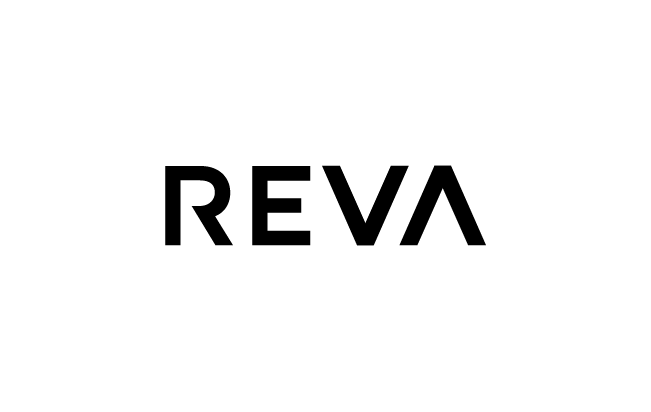 REVA 3.0
Early Wordmark Exploration
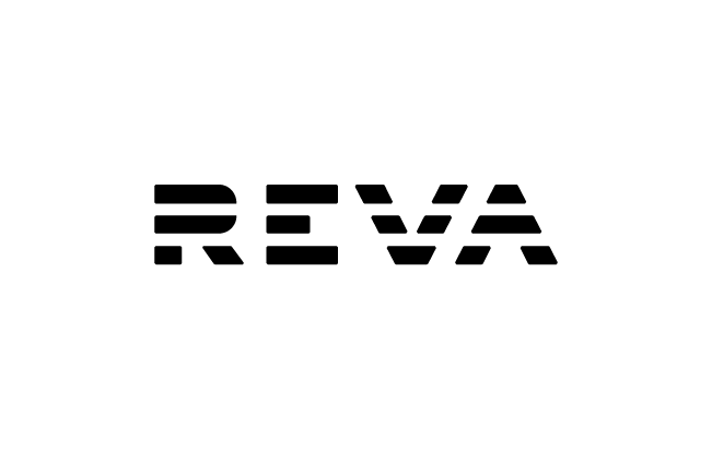
With REVA 1.0, the construction of the custom wordmark was more a reductive process — removing lines from an existing typeface. It felt too much like the RVCA logo to me, so I moved on to something different.
In 2.0 I went simpler, bolder, more angular but canned it due to legibility concerns. This mark was largely going to live on the bike’s downtube so it would need to be read quickly from far distances.
In 2.0 I went simpler, bolder, more angular but canned it due to legibility concerns. This mark was largely going to live on the bike’s downtube so it would need to be read quickly from far distances.
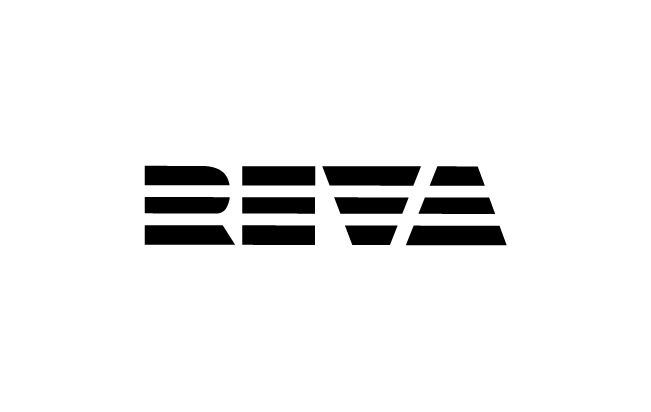
Cue REVA 3.0, which was simple, clean, and hyper legible. It’s downfall was the more ubiquitous sans-serif approach, which didn’t fully represent the REVA brand.
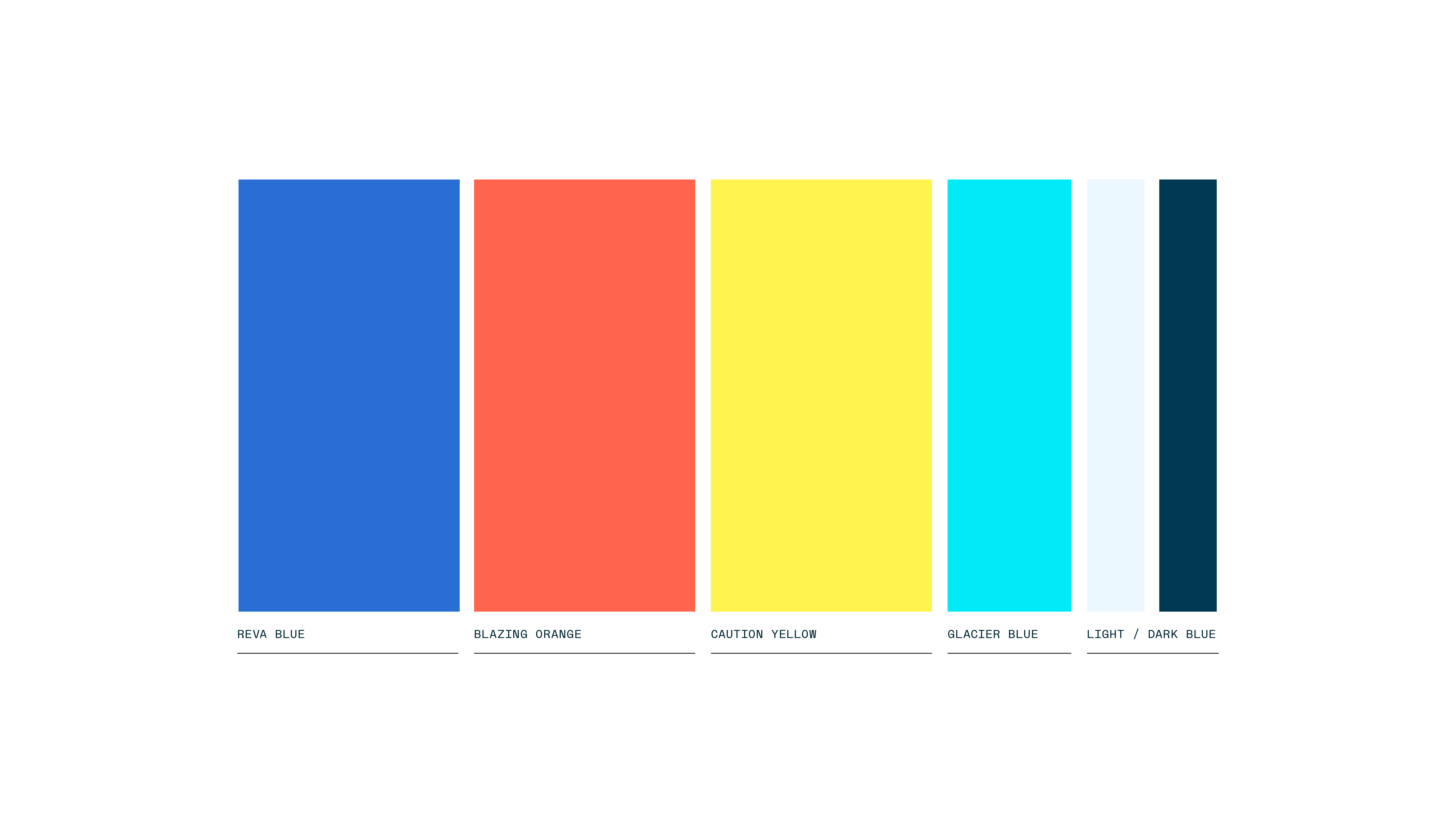
Color Palette
The REVA family of logos are complimented by this bright, energetic, and attention-grabbing set of colors. The REVA Blue instills a confidence, the Blazing Orange provides a balanced warmth and excitement, the Caution Orange brings energy and the Glacier Blue is bright and optimistic. The Light and Dark Blue provide neutral backgrounds to tone down the bright primary colors when needed.
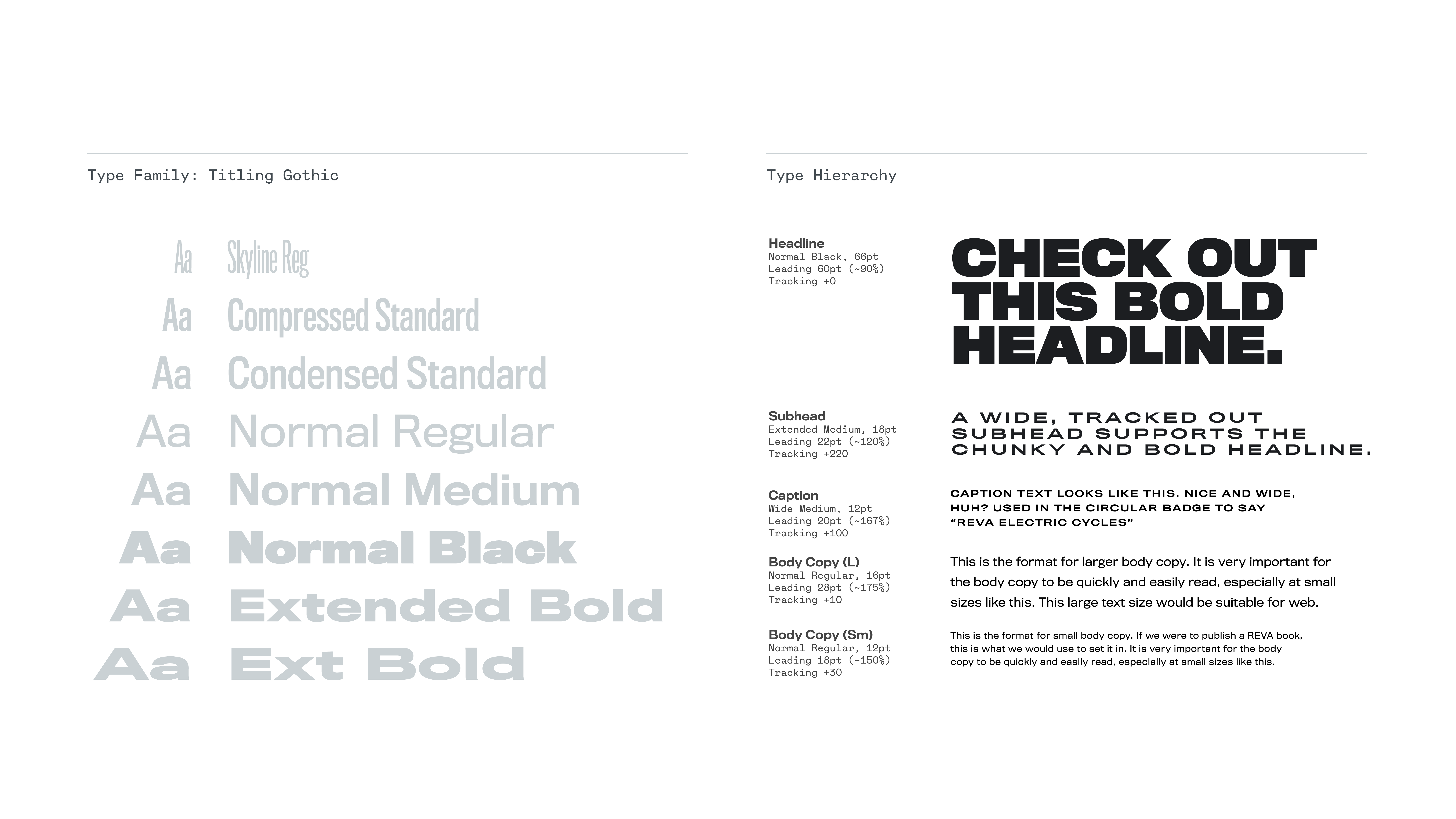
Typography System
REVA is a modern, tech-forward company that needed to present itself loudly and clearly amongst the noise and clutter of a crowded e-bike arena.
To help it clear out it’s own lane within the market (bike joke) we brought in the versatile sans-serif type family Titling Gothic created by Font Bureau in 2006.
To help it clear out it’s own lane within the market (bike joke) we brought in the versatile sans-serif type family Titling Gothic created by Font Bureau in 2006.
It’s many weights and widths allowed for flexibility in messaging and gave us the ability to stand out and be seen. Plus, the squarish proportions reminscent of an older Eurostile give it that old-school meets new-school, not-quite-retro vibe.
