Posters
2016-2019
For when it’s time to sling some ink.
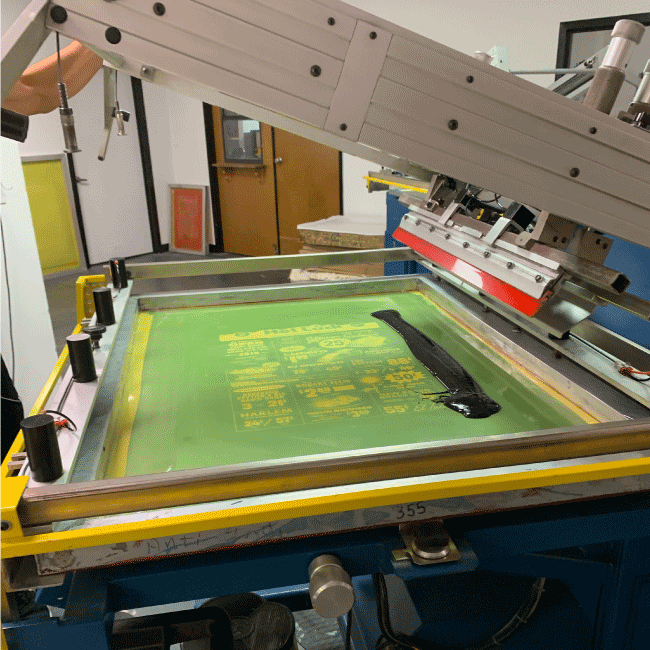
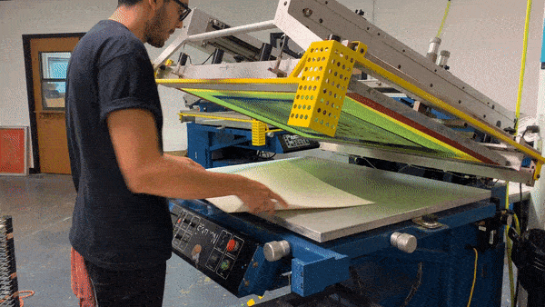
Various posters, for both client and personal projects. All screenprinted. There’s nothing quite like the fresh smell of ink when it’s hot off the press.
Services →
Poster Design
Print Production
Poster Design
Print Production
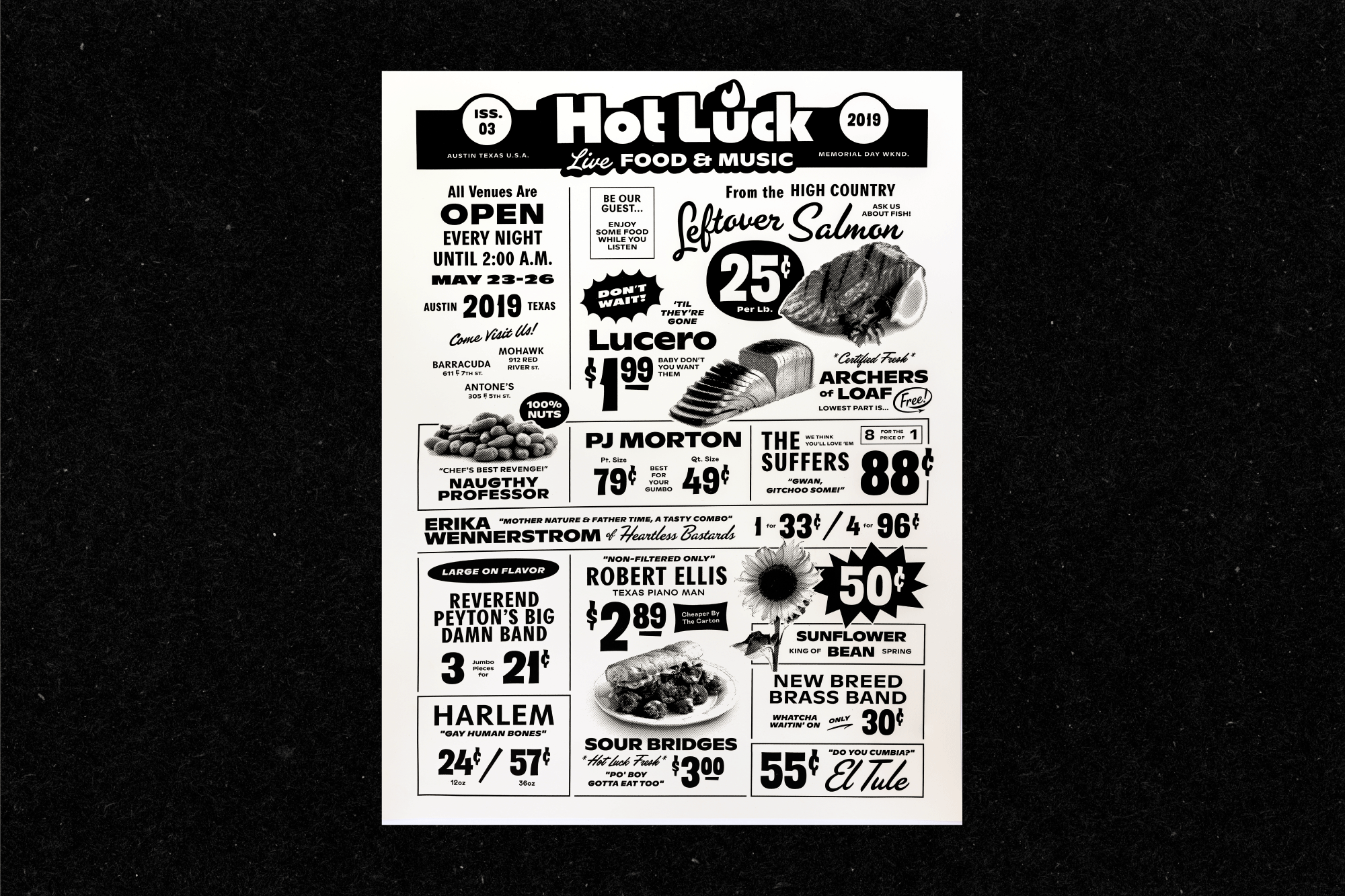
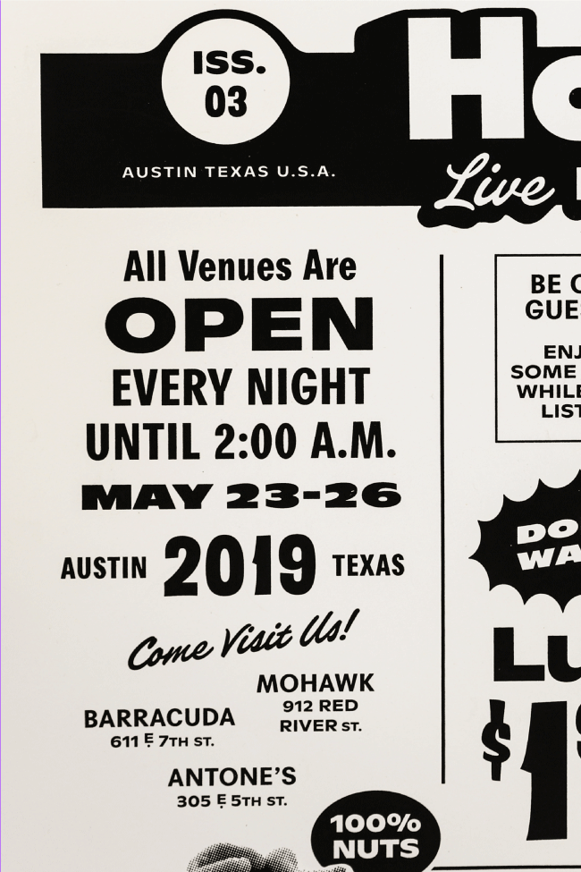
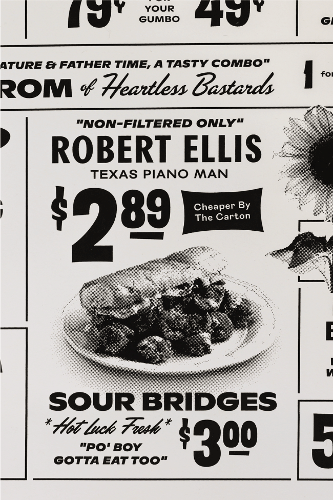
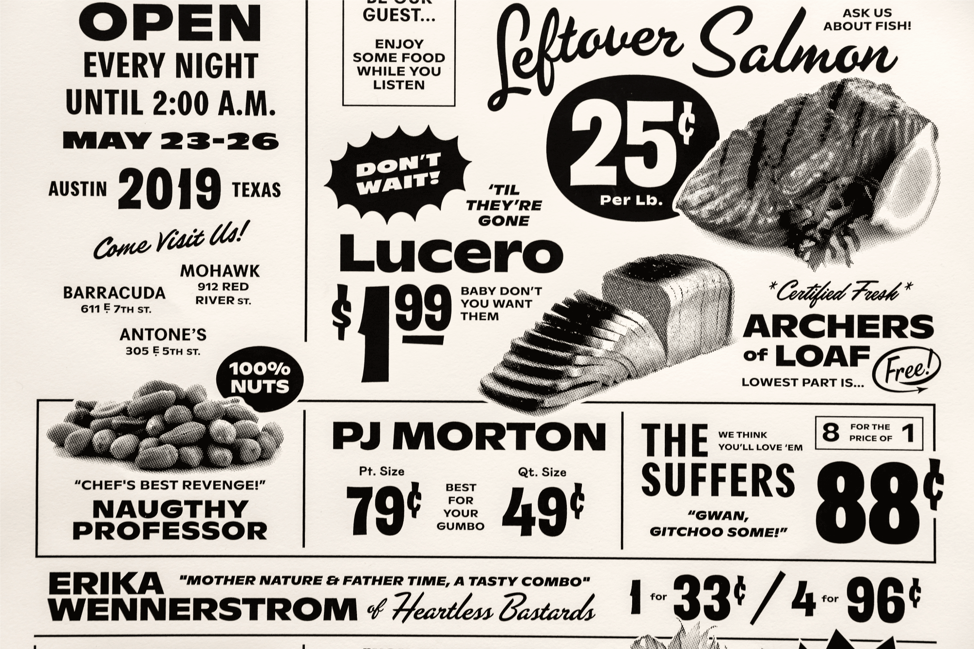
Lo-Fi Grocery Store Lineup Poster
Hot Luck, 2019
Hot Luck is DIY casserole of the culinary and music world. With an impressive lineup of some of the country’s best chefs, there’s also quite the music lineup to boot. I designed a vintage-grocery-store themed lineup poster with some crunchy halftones and even crunchier prices. “Gwan...gitchoo some!” These old ads were so un-designed with a crazy mix of type and layout, so I decided to go all out.
1/0 Screenprint, 18" x 24"
→ Straight up just Black Ink
→ Neenah Classic Crest Natural White 120C
→ M&R Saturn Platinum 3040 Press
Creative Direction Guerilla Suit
Words The one, the only Kevin Whitley
Printing Industry Print Shop
Typefaces Ginto Nord, Agipo, Mabry, Flare, Filmotype Keynote,Filmotype Leader, Brite Script, Harry Obese
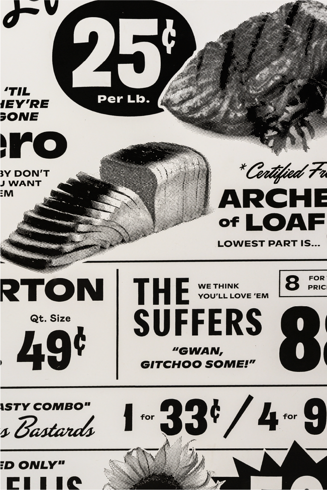
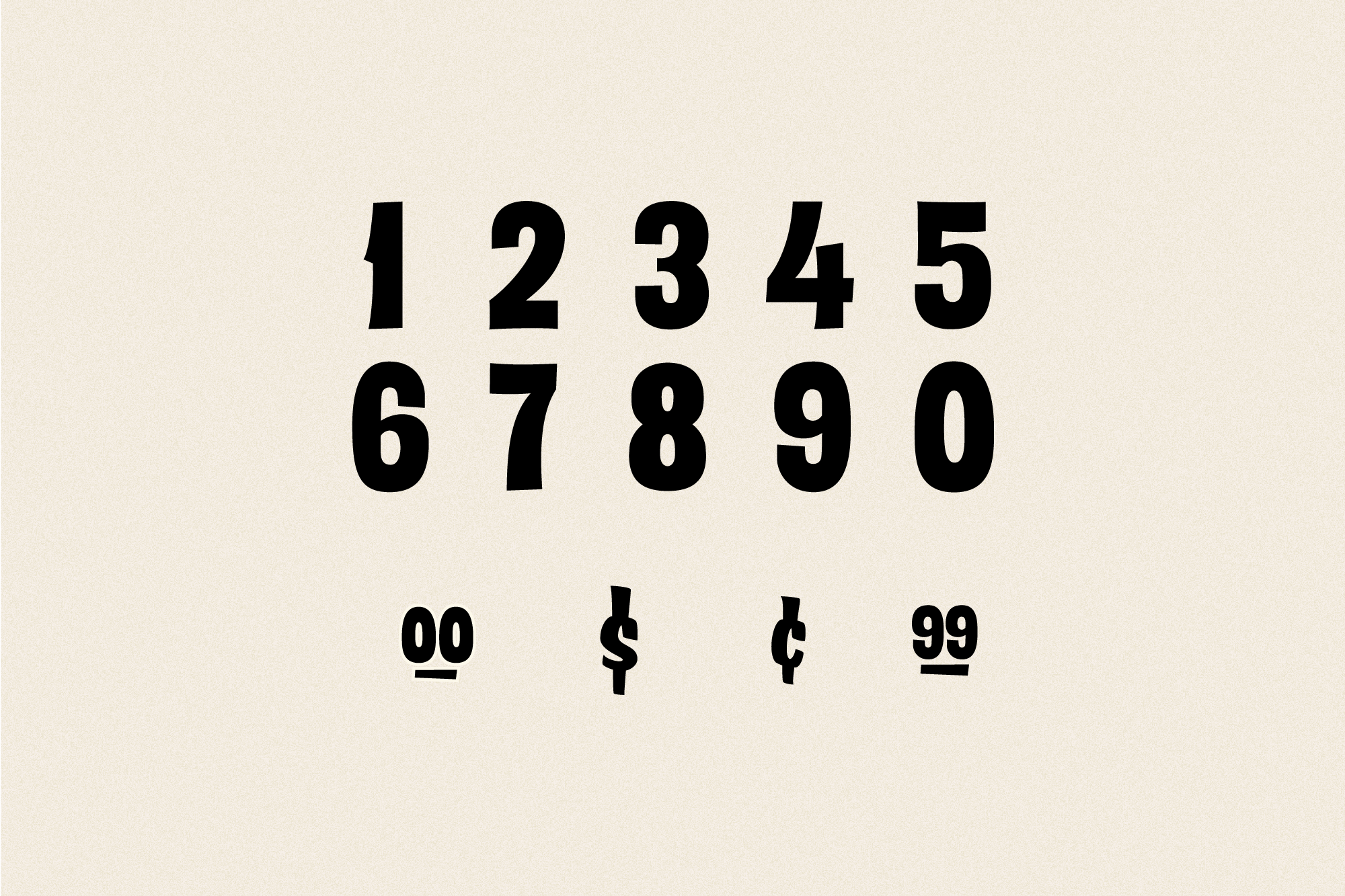

Custom Type
To make this one just a little more special, I drew up some custom numerals, emulating the classic grocery store signage.
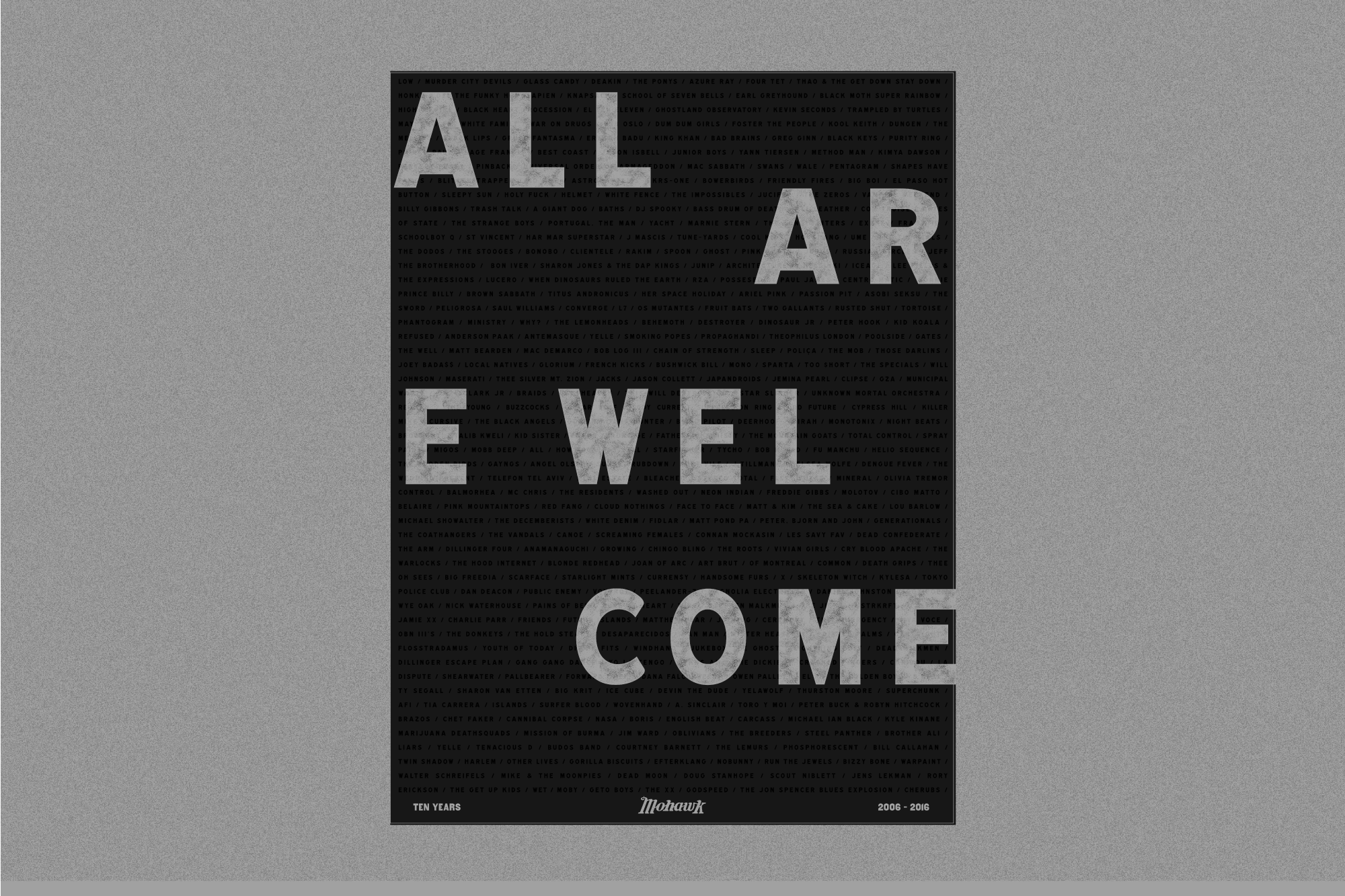
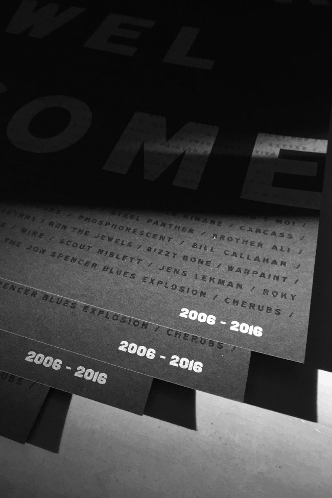
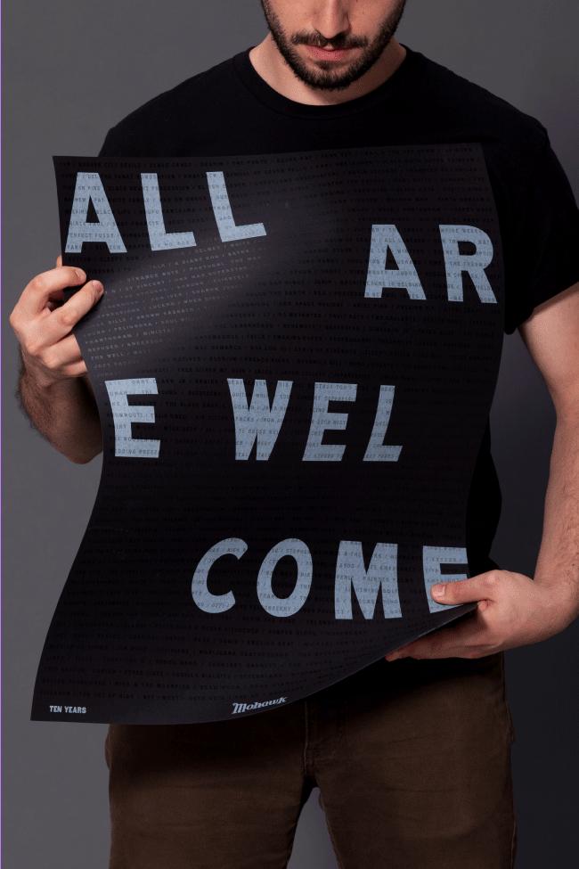
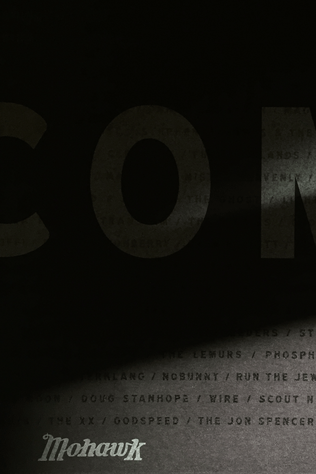
Mohawk 10-Year Commemorative Poster, 2016
The Mohawk is one of Austin’s best music venues. In the first decade of operation, it has hosted acts of all kinds—from the Fleet Foxes to Iggy Pop, Big Freedia to The XX. This poster highlights the best and brightest to have come through those famed, yet slightly dirty doors. All Are Welcome.
2/0 Screenprint, 18" x 24"
→ Semi- Opaque White Ink and Clear Varnish
→ Neenah Classic Crest Epic Black 120C
Creative Direction Guerilla Suit
→ Semi- Opaque White Ink and Clear Varnish
→ Neenah Classic Crest Epic Black 120C
Creative Direction Guerilla Suit

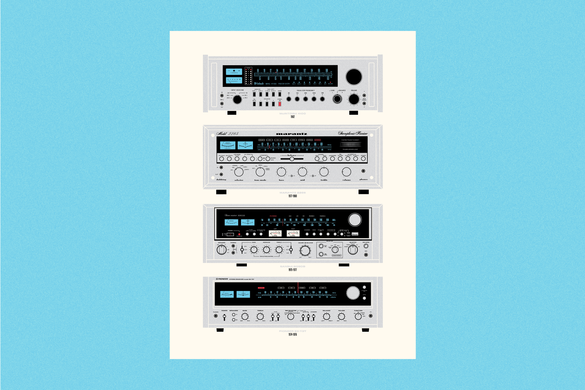
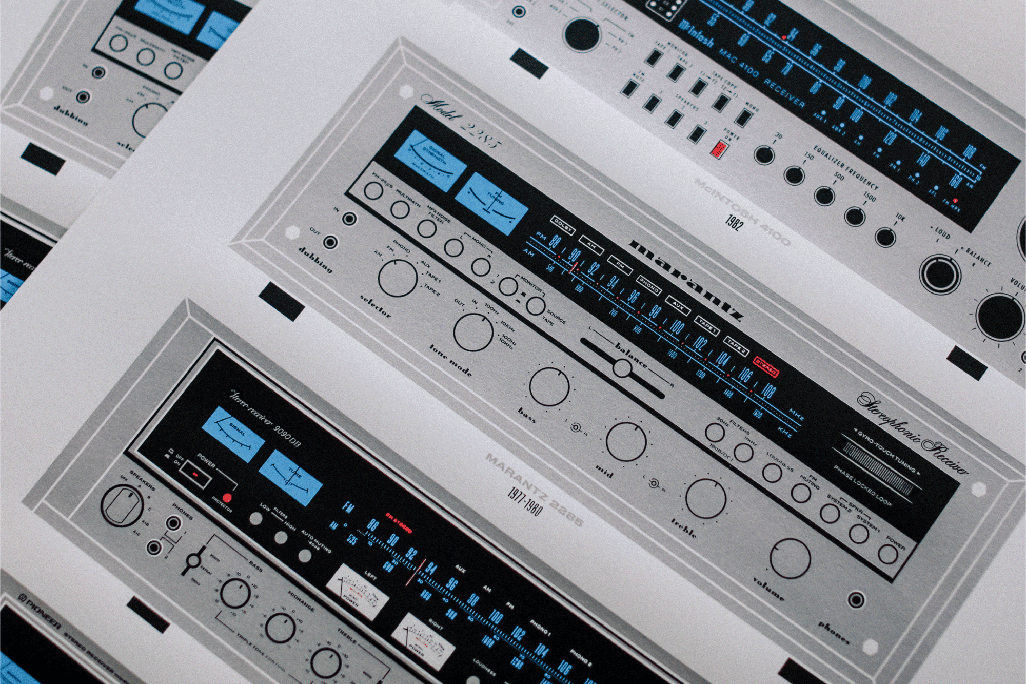
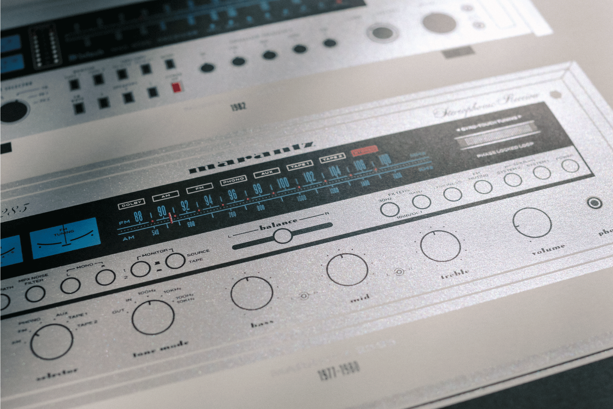
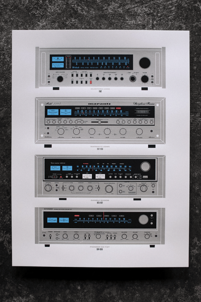
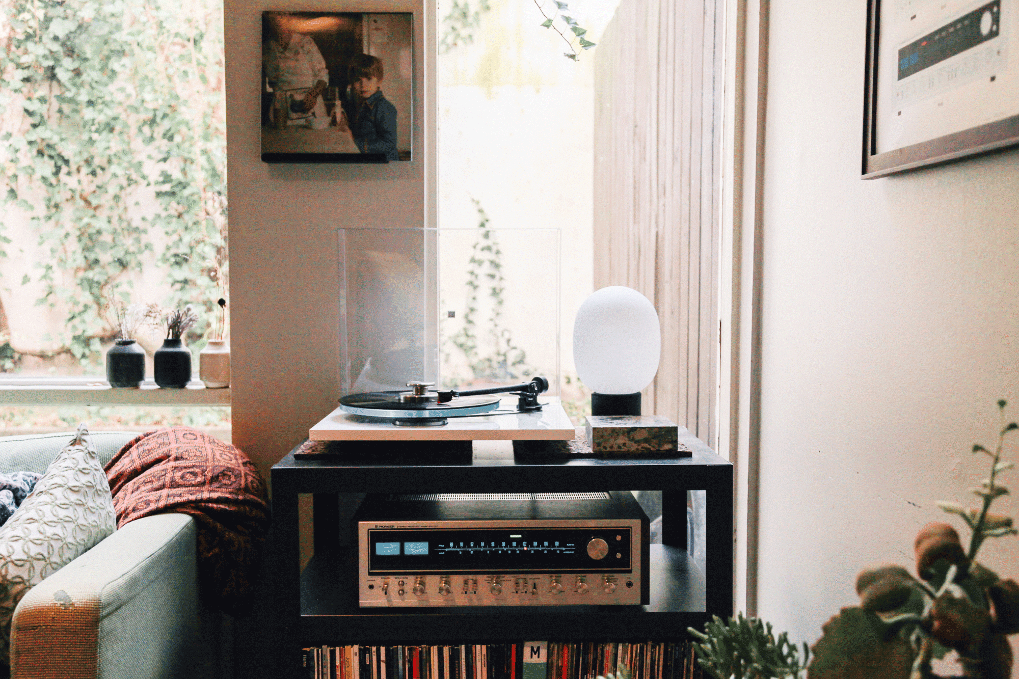
Golden Age of Silver-Faced Receivers, 2018
Done for the annual Afterhours Poster Show, a themed event that raises money for local non-profits through an annual poster sale. This year, we worked with a group called Kids in a New Groove, which brings music and mentorship to children in foster care.
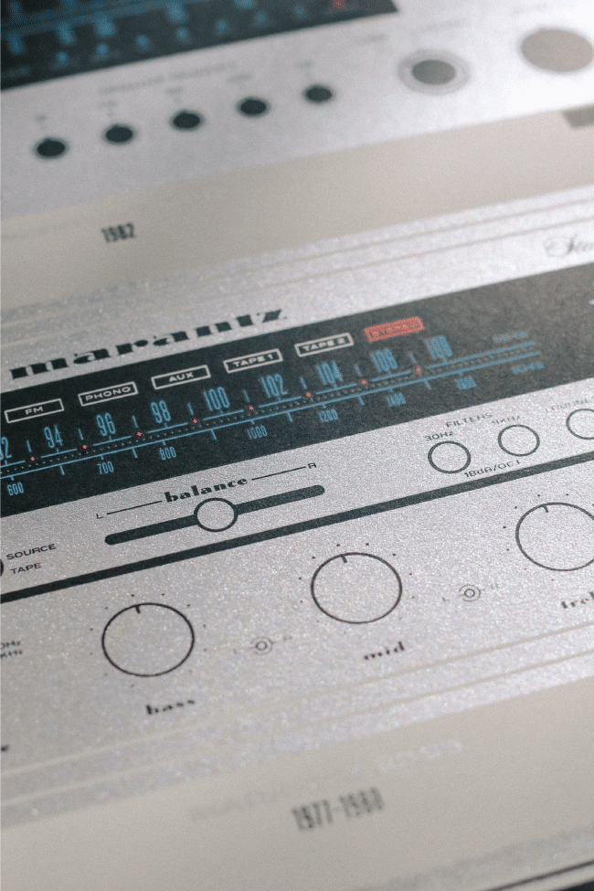
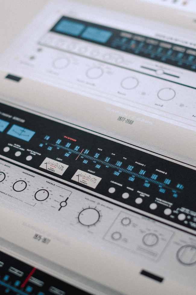
Fitting with the theme of music, I showcased—and illustrated—these painstakingly-accurate stereo receivers made in the early 1970’s and 1980’s; real heavy hitters that are still sought after all these years later. From bottom to top: Pioneer SX-737 (1974-1976), Sansui 9090DB (1975-1977), Marantz 2285 (1977-1980), McInstosh 4100 (1982).
Fitting with the theme of music, I showcased—and illustrated—these painstakingly-accurate stereo receivers made in the early 1970’s and 1980’s; real heavy hitters that are still sought after all these years later. From bottom to top: Pioneer SX-737 (1974-1976), Sansui 9090DB (1975-1977), Marantz 2285 (1977-1980), McInstosh 4100 (1982).
4/0 Screenprint, 18" x 24"
→ Metallic Silver, PMS Red 032C, Blue 0821C, Black
→ Neenah Classic Crest Natural White 120C
Printing Fine Southern Gentleman
Photos Stephanie White & Me
Typefaces Titling Gothic Wide / Extended / Skyline, Druk Wide, Termina, Eurostile, Edgar, Vitesse, Twentieth Century, Metropolis, Davison Spencerian, Berthold Script, Las Vegas Fabulous, Verlag Compressed, Sensational Sans, Knockout
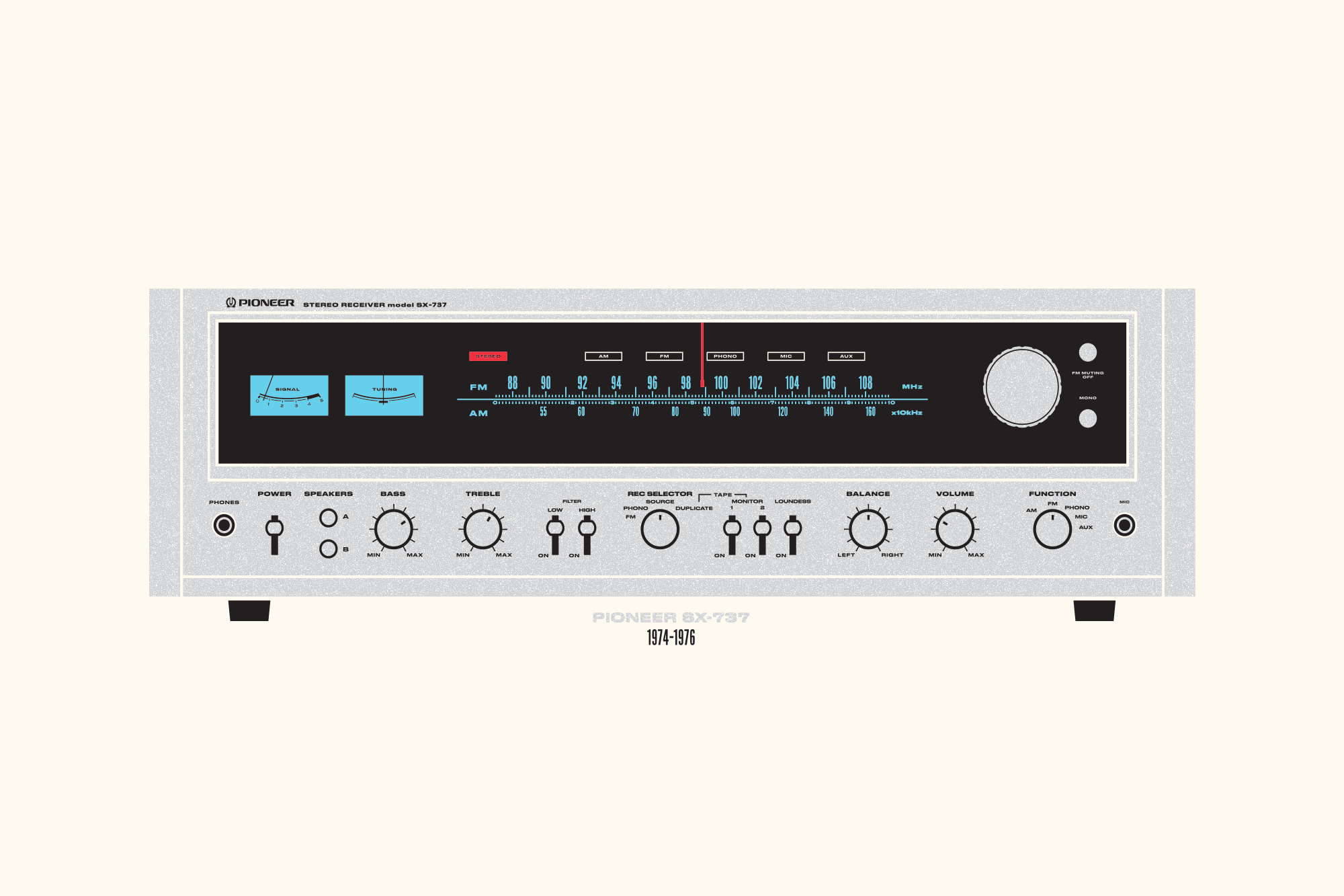
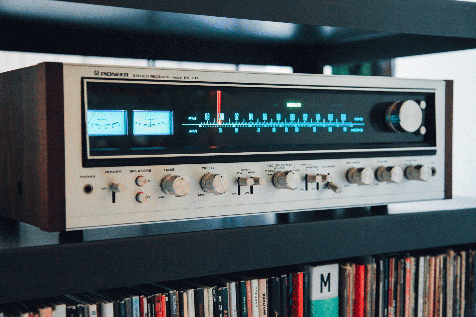
Inspiration
The Pioneer Stereo Receiver Model SX-737, manufactured in 1982. I had purchased this relic of a receiver and fixed it up a few months before the show. I was, and still am, enamored by the warmth of the lights, the gleen of the silver case, the details in the knobs and dials, and the countless design choises that make up the face.
This became the basis for my poster, featuring other such receivers that were all defined by the era.

© Day& Co. 2025