Mohawk Logo
2019
Redrawing the logo of my favorite Austin music venue.
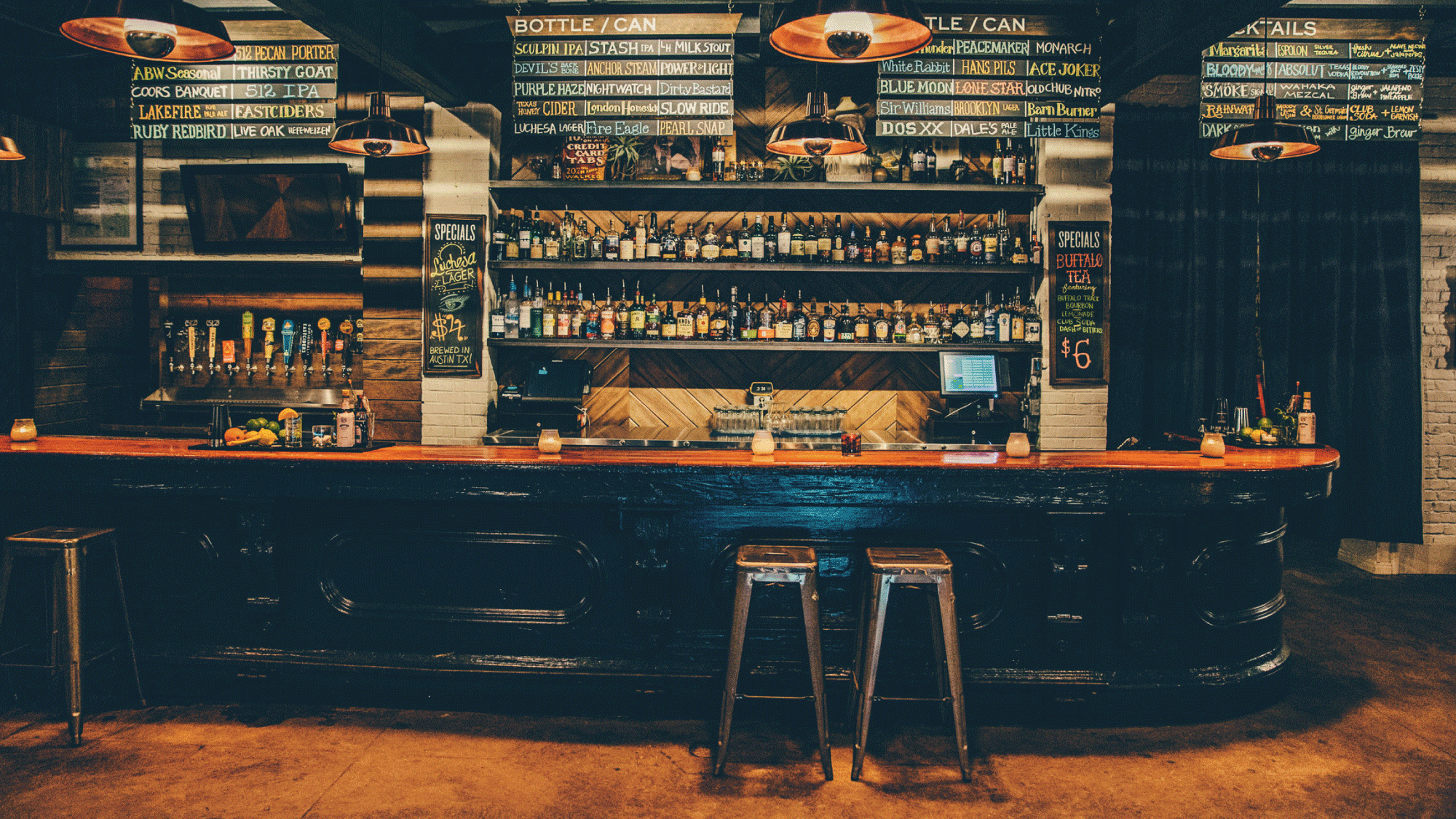
The Mohawk is one of Austin's best music venues. Period. When it was established in 2006, the logo was drawn from a Class A Stock for the "All-American Mohawk Corporation" (1929). It featured a wonky, italicized serif, but with script connections. "Austin•Texas" had been nestled beneath, but when that was removed years later an odd space remained.
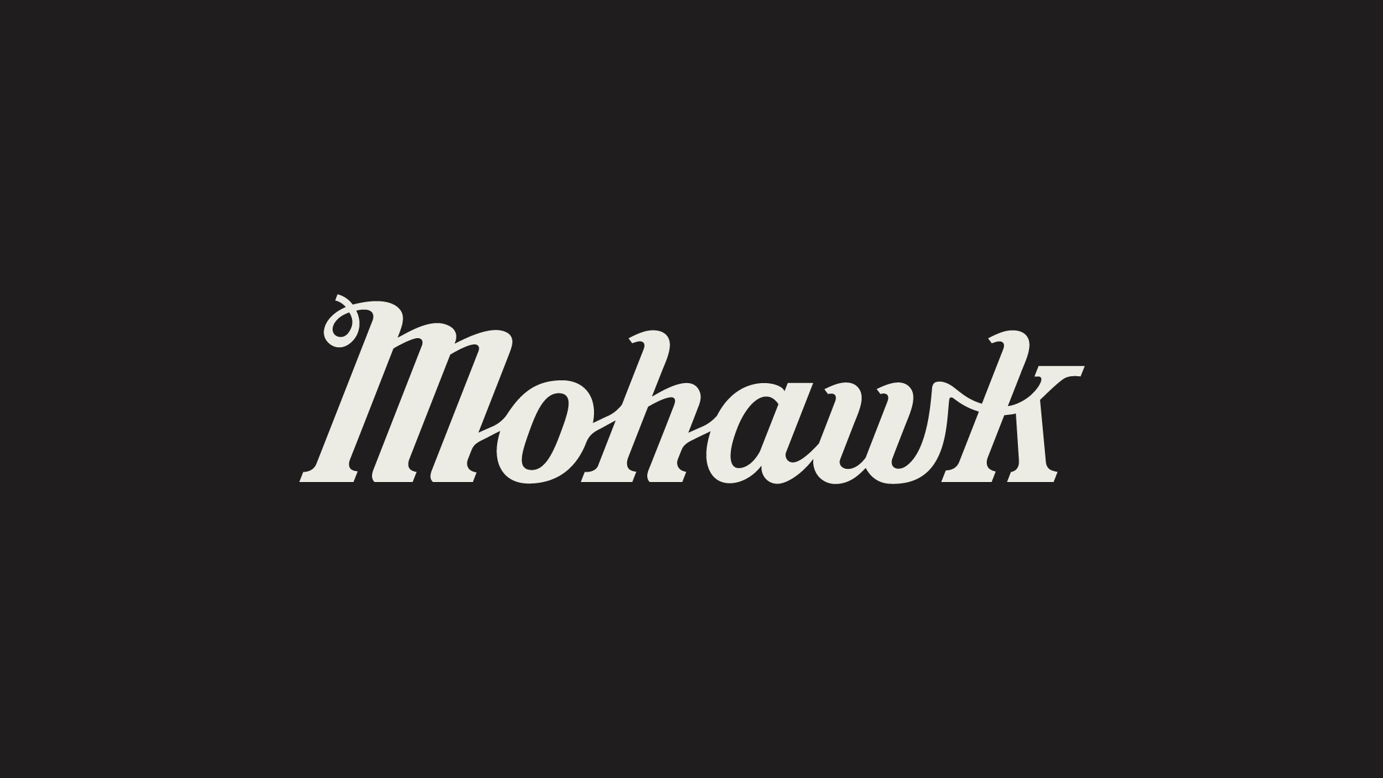
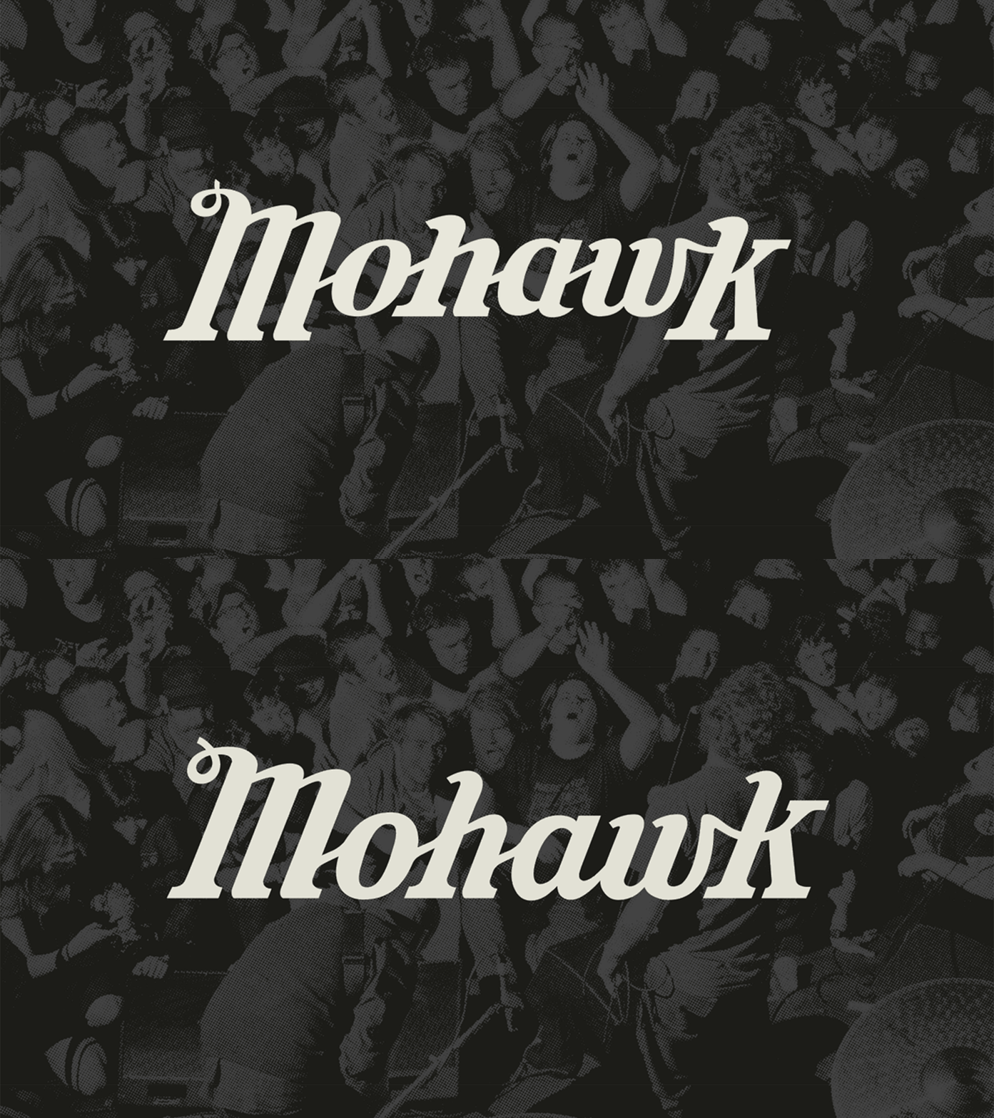
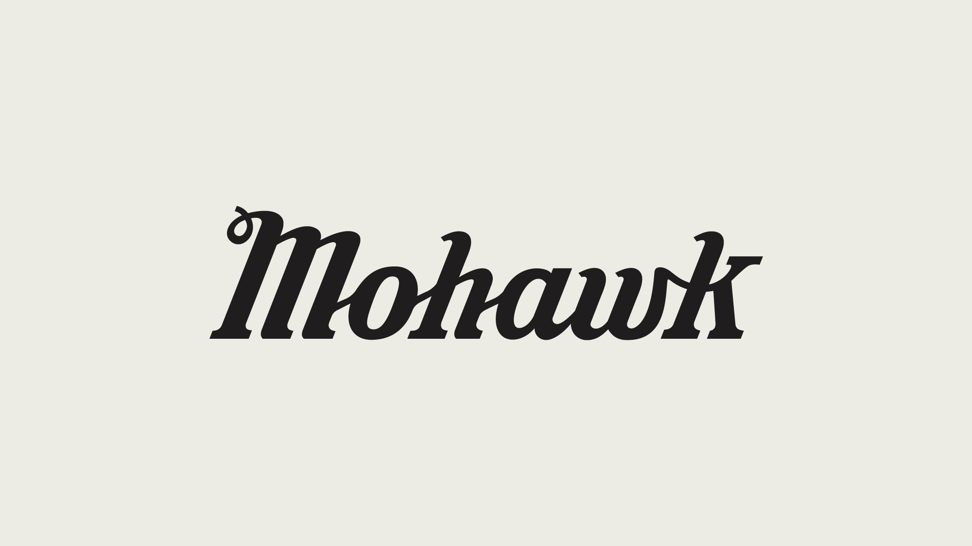
Almost a decade later, Guerilla Suit was overhauling the website so I asked to work on updating the logo. While keeping the original and beloved charm of the serif-script, I completely redrew every letterform to make it feel more fluid and balanced.
Services →
Custom Type
Logo Update
Lettering
Logotype
Custom Type
Logo Update
Lettering
Logotype
Credits →
Studio Guerilla Suit
Studio Guerilla Suit
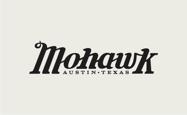
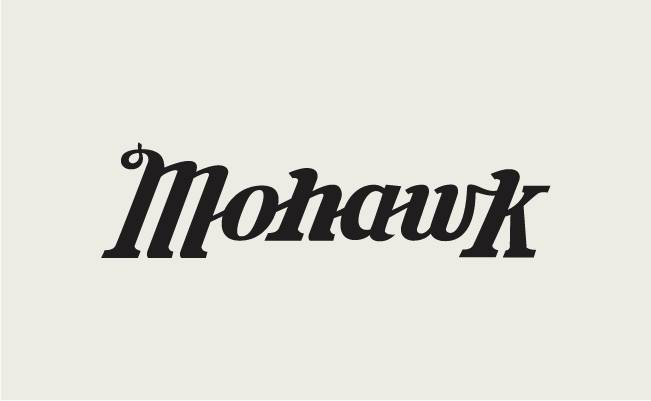
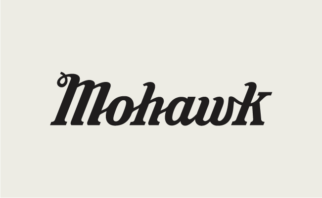
2006 - 2015
2015 - 2019
2019 - ∞
The Need for Change
When the original Mohawk logo was created in 2006, it was a newcomer in the long history of Austin’s live music scene.
To give it a sense of place, it was always adorned with “Austin • Texas”. Once the Mohawk had fought many a bar fight and established itself amongst the ranks of music venues in the city, those words were removed. But what remained was that pesky little space below “ohaw”.
Fast forward to 2019, when I got the opportunity to address all the fun little spaces and quarks in the logo. I aimed to keep the character while addressing the main weight inconsistencies and tidy up everytning else.
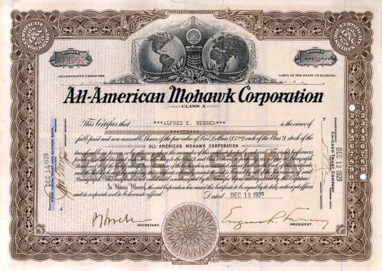
Original inspiration for the Mohawk Logo (1929)


Logo Application
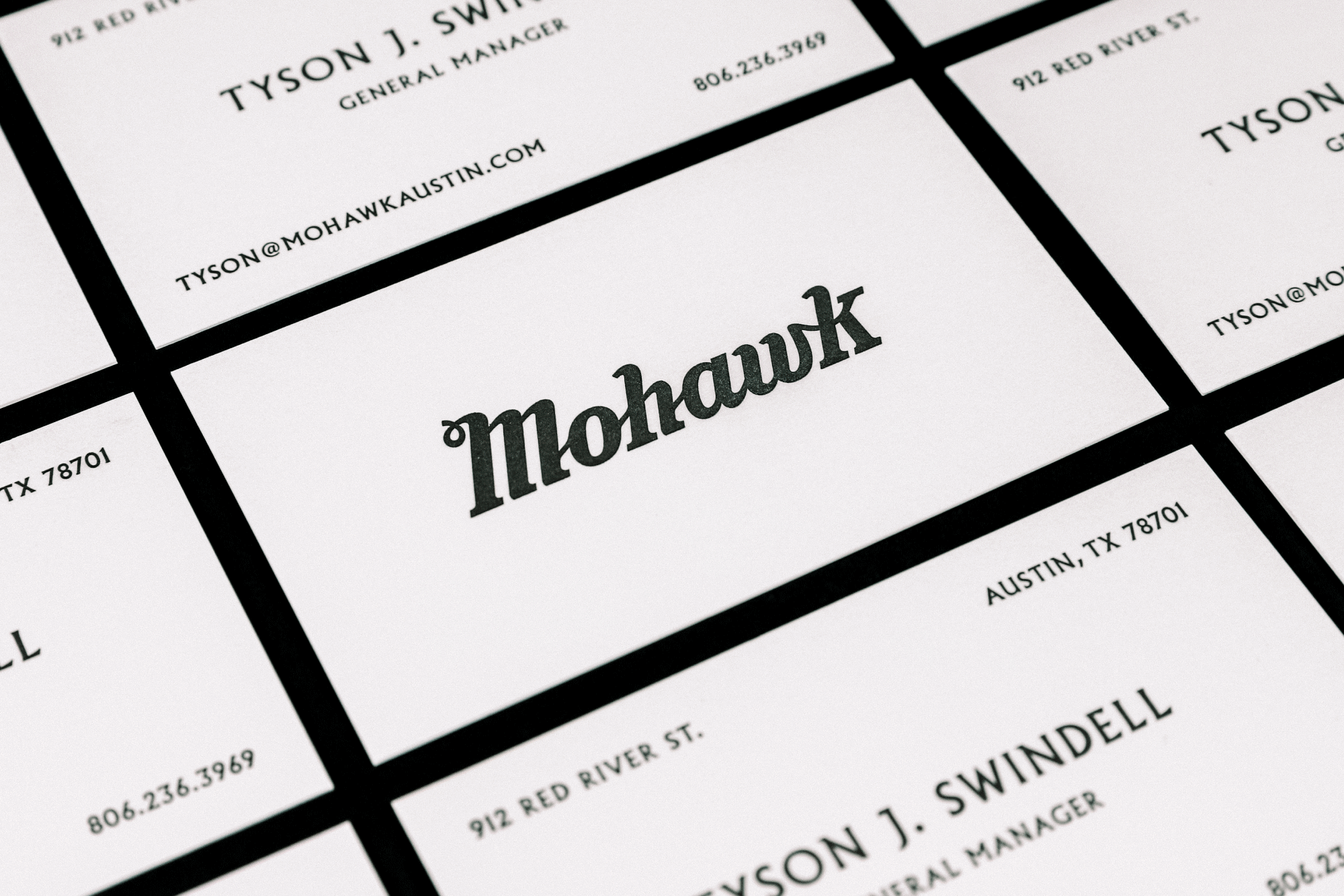
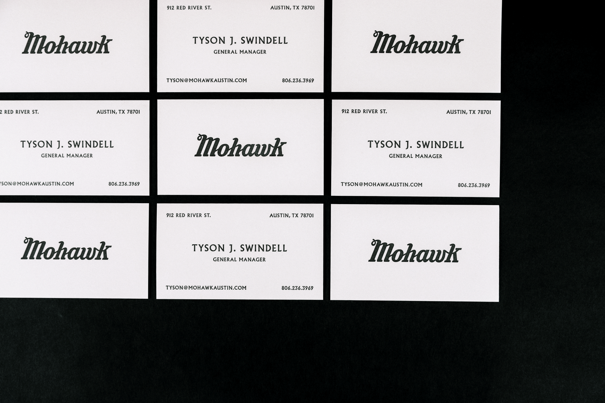
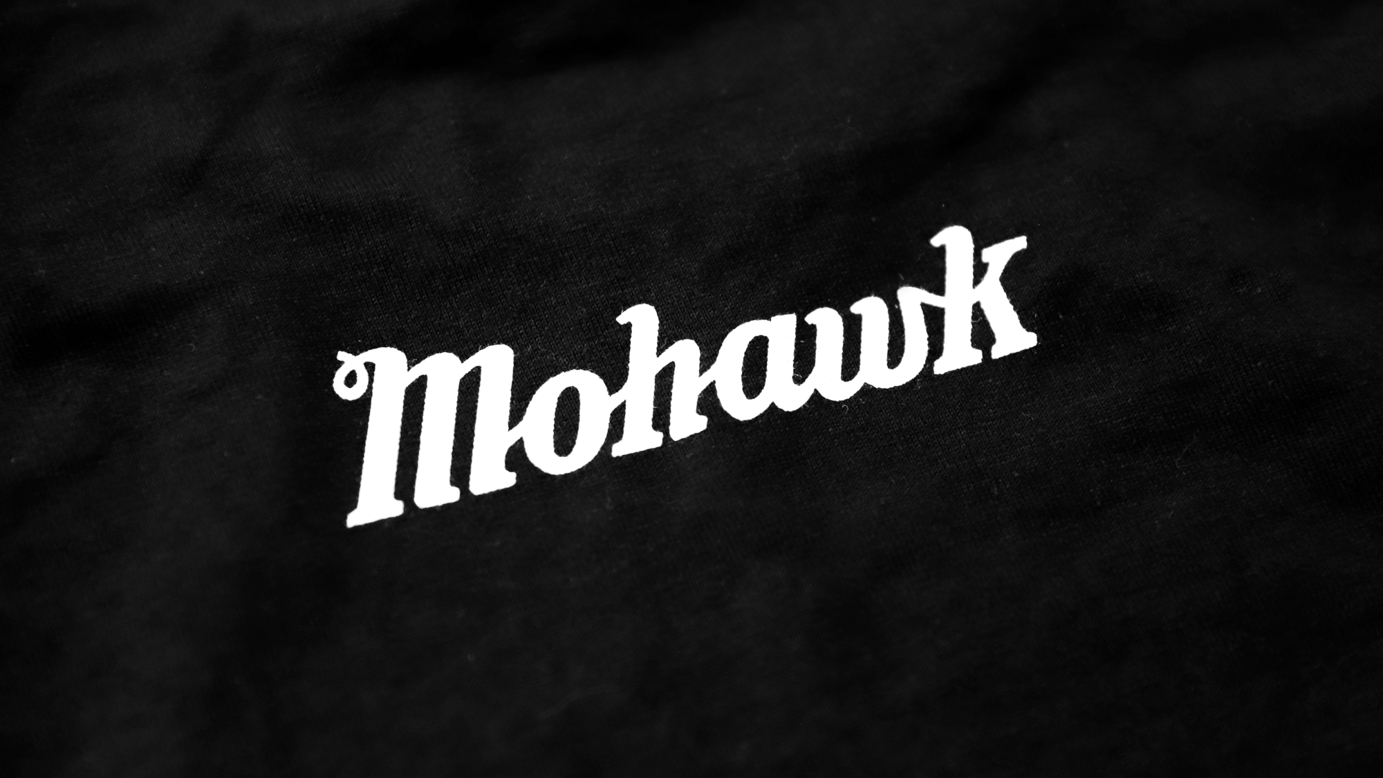
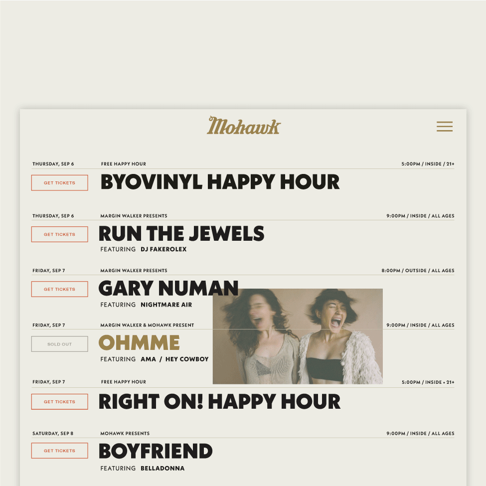
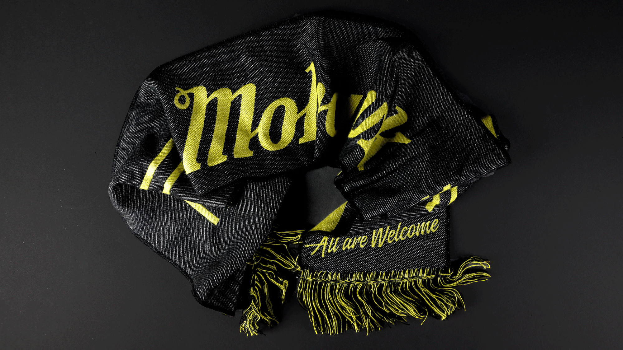
Once fully vectorized and finalized, the Mohawk logo made it on everything from the standard business cards, website, and apparel, to the less standard soccer scarf.
Credits →
Design Guerilla Suit
Design Guerilla Suit
Apparel The Mohawk
